Hasbro’s “Tatooine Wave” of figures in the 2006 basic line has some of the more heavily anticipated new figures to come out in a while. At the same time the wave dished out some unwanted clutter and some resculpts that people didn’t even necessarily know that they wanted too. I’d lump our latest review in the last column there, as the Cantina patron Momaw Nadon has the honor of being one of the very few figures from the bar to get a resculpt of himself out in the line.
Does the figure live up to the standards though? Is he a vast improvement you can’t live without? Well, he’s an improvement, but how vast of one is dubious at best. Hasbro seems to have lost the manual on how to improve a toy and make it worth buying a second, third, fourth, or in some cases even fifth time. Almost any figure can stand a bit of a facelift, but for your $7 you may want something a bit more than some cosmetic surgery.
Hasbro’s proven great things with aliens from the infamous Mos Eisley Cantina as well, and in the basic line to boot. So with precedents set, the big H has a lot to live up to with Momaw Nadon, the infamous Hammerhead. Where they hit the mark and where they missed completely is all laid out in my latest review, so read on for the juicy details on our latest barfly.
PROS
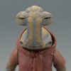
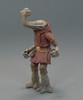
-Sculpt: The character of Momaw Nadon (Hammerhead to your old timers) is a figure that Hasbro’s visited now twice in the past. Neither figure was perfect but to most people the flaws weren’t noticeable enough to warrant complaining it seemed, or high demand for a new version of this character. Basically, people were content.
The new Momaw Nadon sculpt though shows fans that you maybe didn’t simply KNOW you wanted this new figure… And you may still not really have wished for this figure, but it’s hard to deny that Hasbro improved on the sculpt of him with a ton more detail and a more true-to-film figure. It’s so different actually, that the two prior versions of Momaw on the market are so unique that all 3 could be in your diorama and look ok together. A pro unto itself.
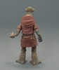
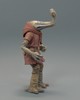
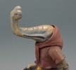
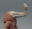
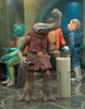
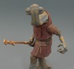
Virtually every aspect of Momaw is vastly different to his previous versions. For instance his skin is much more wrinkly than previous sculpts, and looks much more weighty and thick. The result is a more elephant-like look to his physique (especially the lower legs/feet) whereas the previous figures looked almost tree-like. He has nice little details like increased skin creasing at the elbows, finely sculpted claws/toenails, and individual fingers on each hand. His head is the most similar looking piece of his sculpt to his previous incarnations, and yet there’s a uniqueness to it as well.
You can see some kind of teeth or some such in his dual mouths and his eyes are sculpted carefully with narrow, squinting eyelids. The result is a lot of detail to the figure that the others don’t lack, this figure just seems much more accurate to the film’s character than the previous versions. It’s almost like the others are young Ithorians and Momaw’s an old timer maybe.
The character’s costume is similar to the previous sculpts, but yet it’s much more worn, tattered, and detailed. Hammerhead also seems to have gone from wearing little intergalactic short-shorts and now he wears torn trousers. This new Momaw’s outfit is definitely worn and weathered, and he’s seen some hard times in his past. The other two sculpts look like they’ve got a little more money for clothes it seems.
The wear and tear on the clothing is great too. The pants for instance have “X” stitching on the outside seams that appears to be all that’s holding the figure’s trousers on at the sides. The legs are worn and tattered… They’re also tight looking which makes one wonder how he gets his giant feet into small pant legs, but that’s neither here nor there. The character’s tunic is equally worn at the bottom of the “skirt” piece. There’s a lot of detail in the shirt’s sculpt to give the impression of a heavy woven fabric. It’s very coarse and the texturing detail goes vertically and horizontally to really show how heavy the outfit looks.
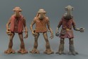
The other details then are Momaw’s leather belt with a pouch on his right hip and a smaller one on his back. The leather belt has a cool sculpted buckle with a design on it, and below the leather belt is a rope belt sculpted to appear as though it’s wrapped twice around the waist and tied on the left side. The rope belt features a couple small cloth pouches of its own as well. That’s a fair bit of detail, and really for Hasbro to justify a NEW version of a background character that they’ve done twice in the past, the sculpt has to REALLY stand out to collectors for them to want it. This figure is definitely new, it’s definitely better (in terms of accuracy), but at the same time the other figures aren’t pushed by the wayside. They make good filler as just different Ithorians for your various potential display purposes. It’s good to know old sculpts hold up ok today like that sometimes.
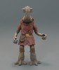
-Paint Aps/Decoration: The new Hammerhead certainly comes with a great sculpt, but as always, a great sculpt is only good when a paintjob that’s equally spiffy is there to highlight the details. Momaw’s paint applications are pretty nice, and while I’d maybe have added some additional paint washing for detail highlights, I still think what we got brings out the best details in this figure’s sculpt just as it should.
The figure’s brown tunic is where I would’ve personally added a darker brown paintwash to highlight the crisscross texturing in the sculpt I mentioned above. The tunic is ok as a plain dark brown color though, and Hasbro saw fit to paint the figure’s pants and shirt under his tunic (you can just make out the ends of his sleeves under the tunic sleeves) a lighter shade of brown-grey. I have noticed that, at the jagged/tattered edges of his inner shirt sleeves and his pant legs, the paint strays on the leg some, but fortunately the color isn’t too dissimilar from the skin color of the character’s skin so it blends in somewhat. It’s only noticeable upon inspection and would’ve been pretty difficult to keep perfect without straying I imagine.
One of my favorite little details is that on each pant leg there is an “X” stitch that’s fairly large on the outer seams. I noted that in the sculpt portion, and it is nice to see that Hasbro painted the “X” stitch black on both pant legs. It looks like Momaw did some sewing to keep his pants on himself at some point along his travels and the big X’s stand out on a stark background. They do add to the “worn” look of the figure’s outfit quite well.

The figure’s belts are both painted with unique colors. The figure’s brown leather belt is a dull brown, but stands out against the tunic as it’s a completely unique shade. The buckle is painted a brass color and is even and cleanly applied. Some of the buttons or rivets on the pouches could’ve been touched with a dot of black or some such, but it’s not a huge matter. The figure’s other belt is also painted nicely. The rope belt features its own shade of brown with little other to speak of. Again some paint wash on it maybe would’ve highlighted it a bit for the quality sculpting it is, but it’s not too bad and we’re up to a number of different shades of brown paint on this figure already.
Momaw’s skin then is cast in a brownish color itself. Here’s where Hasbro comes through with a great paintwash too, as the figure has heavy grey washing that fills in all the cracks, crevices, and wrinkles. The wash is wiped away clear down to the original color of the plastic in raised areas and makes the figure’s skin look aged. The contrast between the brown and the grey wash is really distinct and noticeable. The figure’s toenails have dark brown paint applications and his eyes are glossy black dots. The details are the only fine detail work on the figure overall, but the skin is really the showpiece. It stands out and looks fantastically alien. Definitely a plus over his previous figure’s, and again another way this figure looks completely unique when compared with them.
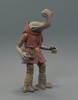
-Accessories: Momaw Nadon’s character is that of a pacifist... kind of a space hippie who winds up on Tatooine. This made it interesting then when his first figure in the POTF2 line came packing a huge cannon of sorts. I guess Hasbro missed the pacifist memo from Lucasfilm?
The new Momaw Nadon comes much more equipped for a sit-in and some groovy tunes at Woodstock. Well, maybe not, but he comes with new accessories that make a bit more sense than a cannon that looks like he found the weapons of mass destruction. The new figure’s accessories are actually true to a reference for Momaw from many years ago, and others are perfect for your Cantina set up.
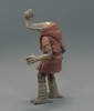
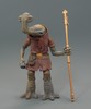
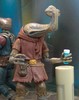
The first accessory is Momaw’s scarf. He comes with a separate scarf piece that fits absolutely perfectly on the figure’s neck area. It slips on and off easily and is cast in the same brown of the figure’s tunic. It looks great on the figure, and it’s sculpt is worn and tattered looking just like his overall outfit, but it also looks great off the figure for some variety. I’m not sure why Hasbro made it a separate piece when it would’ve been less costly for them to have just made the scarf part of the outfit’s sculpt overall. Still, I’m not going to look a gift horse in the mouth though, it’s a nice little extra that I honestly wasn’t expecting.
The figure’s doomsday weapon of the past is replaced by a gentle staff... or maybe he beats the hell out of toddlers with his staff, I don’t know, but he’s got a cool staff and I dig it. Why? Well years and years and years ago, West End Games made the first accurate looking Momaw figure in their miniatures line. The Momaw Nadon mini featured a walking staff very similar to the one Hasbro gave the new figure, and it’s really nice to see it here despite the staff no being part of the character’s on-screen appearance. The staff is cast in a bronze color, and while it could use some paint details on it, the sculpt is still nice and it’s a bit of color to the figure. The staff has some little tassels and ribbed details on it. It’s a nice new piece overall and looks really cool to me. The fact it’s a piece with some “history” to it too is really cool to me.
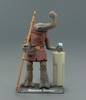
Momaw’s also equipped with some Cantina set-dressing. There is a re-used glass sculpt from the Cantina figures in 2004 as well as the Outlander figures in late 2002. The sculpt of the glass is good and it’s painted blue with a white rim. It looks good and colorful and it’s cool to get more glasses too. The other accessory though is the one people wish they had a few of I think. It’s a small drink stand that looks like a mini-table from the Cantina. The stand is sculpted very nicely with some recessed panel lines that are painted grey. The top has what appears to be either an off-white sticker or paint. The stand really matches the look of the tables and bar in the Cantina, and I wish I could pick 10 of these little things up by themselves.
And that’s 4 accessories before you even get to the normal pack-in stand and holographic miniature. The other bits are great though and most of them are new. I love getting little pieces from a scene like the drink stand too. These are the kinds of bits every figure should have really.
Other pack-ins are then the usual suspects that have come with figures in 2006. There is an embossed stand featuring the film the character appeared in raised on its surface and a silver name of the character painted on the one edge. There is also a randomly packaged holographic miniature figure snuck into the packaging as well. While the stand and miniature are nice, both required molds and effort to be produced and it’s my opinion that the money put into these “gimmick” accessory pack-ins would be better put into the figure itself. I prefer quality toys over gimmicks.
-Older Versions Not Obsolete: As I noted above a couple times, the past versions of the Momaw Nadon figure are not obsolete. The situation is similar in a way to Greedo in the VTSC line this year. All the other Greedo’s are weak by comparison, but they still fill out a scene from Mos Eisley well as there’s a ton of Rodian’s in the same outfit wandering around. The fact those figures didn’t get put in the fodder drawer made me appreciate the VTSC Greedo even more.
The same sort of thing applies to Momaw Nadon’s resculpt. The past two Momaw Nadon sculpts are pretty unique when you compare them to each other (POTF2 basic, and Saga Cantina Bar Exclusive). Their paint applications and even their sculpts are very unique even though they reused parts. The figures blended well together, and now the new Momaw Nadon looks so different that the old Momaw Nadon figures look like (to me at least) younger Ithorians. They’re easily mixed into the background of your Jabba’s Palace, your Cantina, your podrace arena, your Mos Eisley/Espa streets. Hell, slap some cuffs on them and you even have instant Imperial prisoners.
The point is the old Ithorian sculpts look unique and different enough to slip them into your scenes almost as “new” figures. New no-names for background filler if that’s how you like to display your toys. The result maybe wasn’t intended at all by Hasbro, but it is appreciated by me either way since I don’t feel compelled to chuck these older figures into the drawer never to be seen again. Instead my Cantina is getting to fire-code capacity I think. 
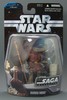

-Packaging: The Saga Collection packaging for each figure is an interesting mix of styles. You can definitely see some elements of the ROTS line mixed with elements of the OTC line, and that makes for a unique package on the shelves. I really enjoy the black cardback with silver lettering, and I hope it’s something Hasbro is willing to stick with for a long time to come.
I also highly enjoy the unique backgrounds for each figure. Pulling an element from the OTC line, the new Saga Collection packaging uses a film shot that pertains to each unique character, and really individualizes the figures. This is drool-worthy for the carded collector and it makes even the die-hard openers want a figure here and there to keep carded just because of how special the backgrounds are.
The bubble is a little closer to the ROTS line in its overall size and shape, but should lend itself more to staying mint for the carded guys. There’s also an insert depicting the specific character and the character’s name, packaged into the bottom of the package just as the Revenge of the Sith figures had. The insert features the bold blocky silver lettering of the Saga, and lets fans know that this is the universal collection of figures encompassing the entire Star Wars universe.
There’s a lot to like with this packaging so I hope it stays as the standard for a while. I would say that The Saga Collection and Original Trilogy Collection will go down as some of the most liked packaging by collectors for quite some time if Hasbro gives it a while, and this is coming from a guy that rips almost everything off its card at some point or another.
CONS
-Articulation: The new Momaw Nadon looks fantastic... however Hasbro had one real surefire way to lock down this figure as being a VAST improvement to his previous incarnations in plastic. Unfortunately they delivered in one of the most underwhelming ways possible, and a way they’ve been dropping the ball pretty routinely all year in 2006. Articulation on the new Momaw Nadon doesn’t surpass the past 2 sculpts by even a single point of articulation, and for Hasbro to skimp on the poseability really hurts my opinion on this figure unfortunately.
The articulation on Momaw Nadon is:
- 2 standard shoulder joints
- 2 standard hip joints
- 1 standard neck joint
- 1 standard waist joint
With a total of 6 points of articulation, this Momaw Nadon is no better than the past versions of the figure, and by 2006 that’s just pathetic on the part of Hasbro’s toy designers. Aliens should be fun for kids by my estimation and sadly Hasbro either doesn’t recognize it or they don’t care. This figure falls incredibly short in poseability. What’s worse is that people have shown images from the film that proves Momaw Nadon actually was sitting in the Cantina... It’d be nice if his figure could do that.
What’s worse than anything though is that Hasbro, in this day and age, would make a figure with a total of 6 points of articulation and that’s it. That’s POTF2 standard, and nothing better. Not a single improvement over the past two sculpts for poseability and it’s really just pathetic because this figure isn’t inhibited by anything for its articulation. Hasbro simply opted not to improve this figure as much as they really needed to I think. This hurt Momaw Nadon a good bit in my overall opinion of the figure.
-Necessity: If you were thinking up a “Tatooine Wave” of figures, and you had to take a couple pseudo-repack figures like the Cantina Han or whatever, but you had all these slots to fill with all brand new figure sculpts - would you have picked Momaw Nadon? I mean, seriously, would this have been a figure you wanted from the Cantina?
Now that’s not to say the figure looks bad. It’s an improvement over its past sculpts, just as I said, but the fact remains that I didn’t see much clamoring for a new Hammerhead from the masses online. As a matter of fact, I don’t recall anyone saying they wanted a new version of this figure ever. It just didn’t seem to be on anyone’s radar really… There was just so much more from the Cantina that everyone wanted that Hasbro had never done before.
And that applies to me too... this was a figure I just didn’t see a need to resculpt. I maybe didn’t realize how inaccurate the past scupts of Momaw were, but then again I don’t feel like I’d be missing anything if the POTF2 figure was all we ever had, especially now that I see that Hasbro didn’t improve this figure’s poseability in the slightest. That’s the only way this figure would’ve really impressed me, and Hasbro didn’t do that so now I really think we could have lived without a new Hammerhead. I’d much rather gotten Bom Vimdin, at least he’d have been new, even if he would have the half-assed articulation Hasbro’s given us in 2006.
-Price Hike: Star Wars figures have taken a jump in price at most all retailers in 2006, and while we paid $5 - $6 for most of our Revenge of the Sith figures throughout most of 2005, figures are up to $7 after tax at most retailers, even the usually stalwart for cheap prices, Wal-Mart. Hopefully Hasbro and Retail will see the light that price increases in this day and age means that people may become more tight with their spending.
I know a price hike will affect my buying habits, and I’ll buy fewer extras of any figure I maybe wanted extras of. I’ll cut back on army building, custom fodder buying, and other areas that I otherwise maybe would have spent more freely. That $1 or $2 starts to add up over 60 or so figures though. With no retailer seemingly wanting to budge on their standard price, things aren’t looking good for a decrease anytime soon. So keep your eyes peeled for sales because when they happen I’ve noticed that figures that were sitting suddenly fly off the pegs.
The price hike sucks, and what really is tough to accept is that in 2006 we’ve seen many fewer figures with “great” articulation like we saw in last year’s line for ROTS. This decrease in overall “quality” coupled with the price increase just hasn’t sat well with me about this year’s line-up. Though those nicely articulated gems like the AT-AT Driver or whatnot do sneak in there.
OVERALL
So Momaw Nadon is wrapped up and that’s another review down in the record books. The figure’s all-new with a pretty great sculpt and paint application. He lets his predecessors live on in dioramas too without looking like duplicates, and Momaw comes with a ton of gear that is really great for the figure and for his scene(s) overall. I love these aspects of the new Hammerhead, but I can’t help but give him low marks because Hasbro took absolutely NO effort to make this figure “better” other than its aesthetics.
Aesthetics are great, don’t get me wrong, but we’re to a point where Hasbro’s taking even the most miniscule steps forward in articulating their action figures, and completely reversing all those improvements. This figure is literally no better to pose than the POTF2 figure... it’s BARELY better than the vintage figure. It’s that kind of half-hearted effort on improvement that really bothers me these days. This figure cost $7 at retail so I’m curious why I paid $7 now and $5 for my original Momaw Nadon. I mean, that just sucks. This figure should sit and at the VERY least swivel at the biceps. It should actually have ball/socket elbows and knees to be specific. Every figure that doesn’t have a “skirt” piece or some such obstructing it should have those articulation points, and this one is no different.
So obviously my opinion on this figure is low. I really feel as though Hasbro is taking fans for a ride on this figure that nobody asked for. It’s nice to look at but they owe resculpts a bit more than what they ultimately delivered here, and especially at their inflated prices these days.
I’m hoping the rest of the line is a little more impressive to me. I know I’m excited to review a couple of these figures, and hopefully get the sour taste of this one out of my mouth... I just hope they aren’t all this weakly designed.